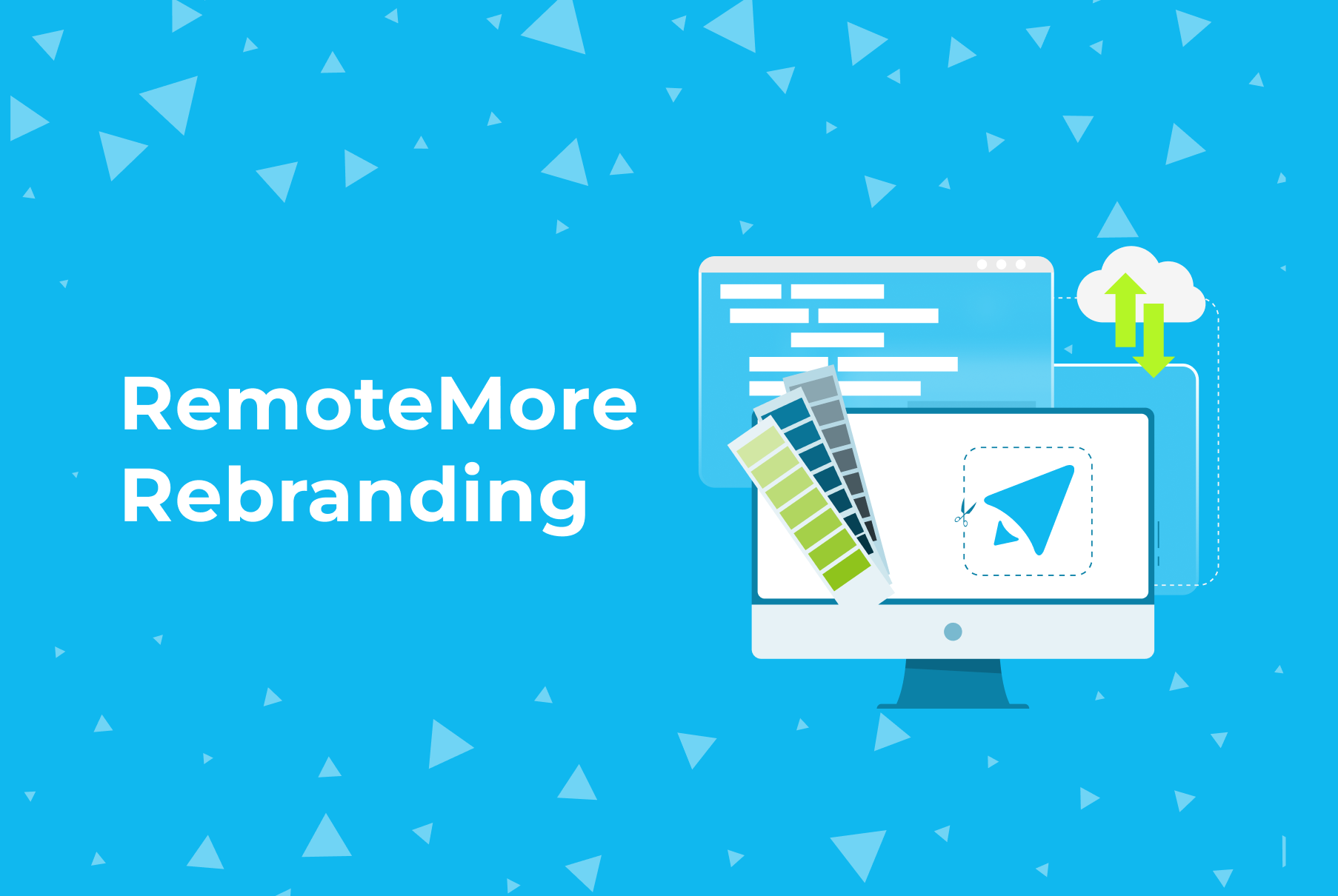
In today’s fast-paced market, a strong, clear brand identity is crucial. At RemoteMore, a company dedicated to streamlining distributed teams across borders, we recognized the need to rebrand as we shifted our focus from B2C to B2B. Our previous branding, while thoughtfully crafted, lacked the clarity and impact we needed to stand out. This case study shares our rebranding journey, showcasing the strategic changes and creative decisions that have positioned RemoteMore for greater success.
Recognizing the Need for Change
Our rebranding journey began with a thorough analysis of our existing brand. The marketing team, together with our CEO, dove deep into competitor research and market trends. We realized that our brand message needed to be clearer and more focused to truly reflect our technical expertise and dedication to delivering solutions for international teams, aligning better with what businesses seek in a B2B context.
Defining Our New Direction
With a clear understanding of where we stood in the market, we set out to refine our brand. Rather than a complete overhaul, we aimed to enhance our existing branding elements, making them more aligned with our B2B focus and technical strengths.
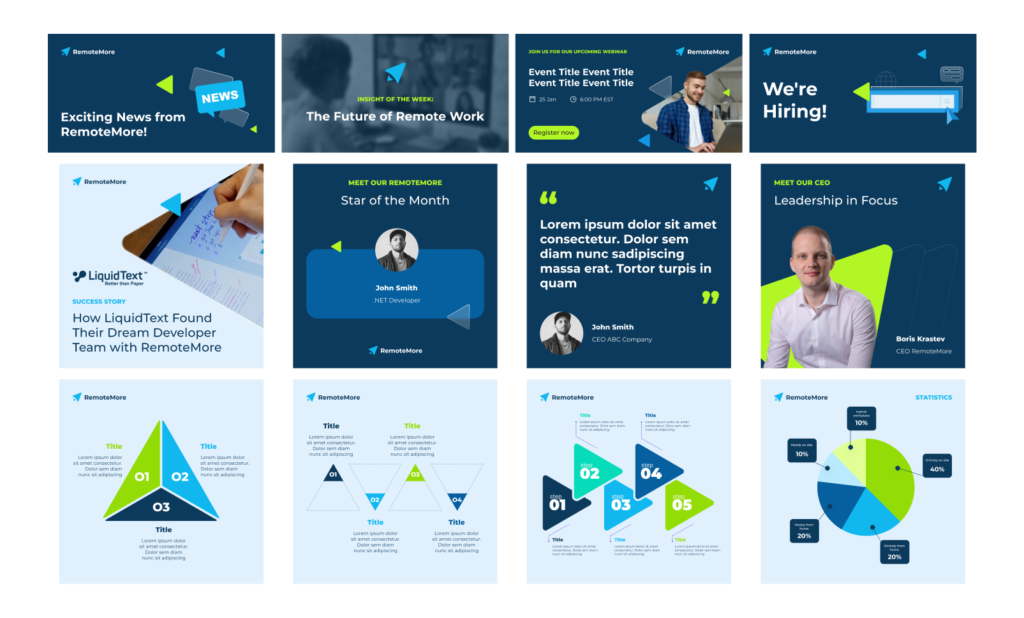
Transforming Our Logo: From Rocket to Cursor
One of the most significant changes was our logo. The original design, which resembled a rocket, symbolized innovation and progress but didn’t fully capture our technical and professional focus. By sharpening the angles and transforming the logo into a cursor shape, we encapsulated both our technical expertise and our forward movement. The new logo features a larger triangle with rounded edges pointing forward, symbolizing progress, and a smaller triangle pointing in the opposite direction, representing flexibility and stability.![]()
Crafting the Brand Book
After finalizing the logo, we developed a comprehensive brand book. This document serves as the cornerstone of our new brand identity, detailing the visual and textual elements that define RemoteMore. Key components of the brand book include:
- Typography: We chose Montserrat for its modern, clean lines that convey professionalism and approachability.

- Color Palette: Our primary colors are deep blue for backgrounds, complemented by bright blue and bright green for accents. These colors were selected to convey trust, innovation, and energy.
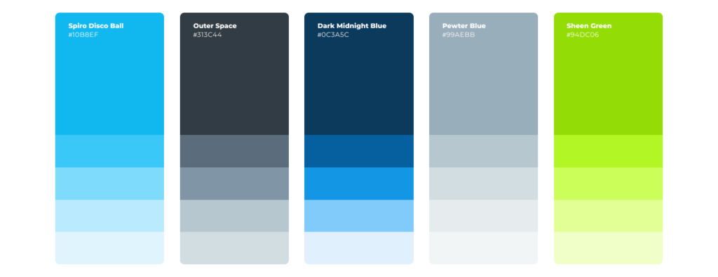
- Visual Elements: The triangle, derived from our logo, is used as a recurring motif in illustrations, icons, and other design elements, reinforcing our brand’s cohesiveness and visual identity.
Enhancing Our Digital Presence
To ensure consistency across all platforms, we developed templates for our social media channels. These templates incorporate our primary visual element, the triangle, in various configurations. By doing so, we maintain a unified and recognizable brand presence, regardless of the platform or content type.
The rebranding of RemoteMore has been a collaborative and transformative journey. Through strategic modifications and a clear focus on our core values, we have successfully repositioned our brand to better serve the B2B market. Our new logo, cohesive visual identity, and comprehensive brand book not only differentiate us from the competition but also communicate our commitment to innovation and excellence in the Future of Work sector. We are confident that these changes will resonate with the business audience and drive our continued growth and success.